Thursday, November 20, 2014

Weekly Blog Post 10

I'll admit that I only picked this one because it's trivariate, and I like how it pulls it off.  Choropleth base, and colors for the proportional symbols.

Weekly Blog Post 6

It looks like a standard hot/cold weather map, but I like the style.

Weekly Blog Map 7

This is a 3d proportional symbol on a globe, and it looks really neat.  I don't know what the proportional symbols represent, though.

Weekly Blog Map 3

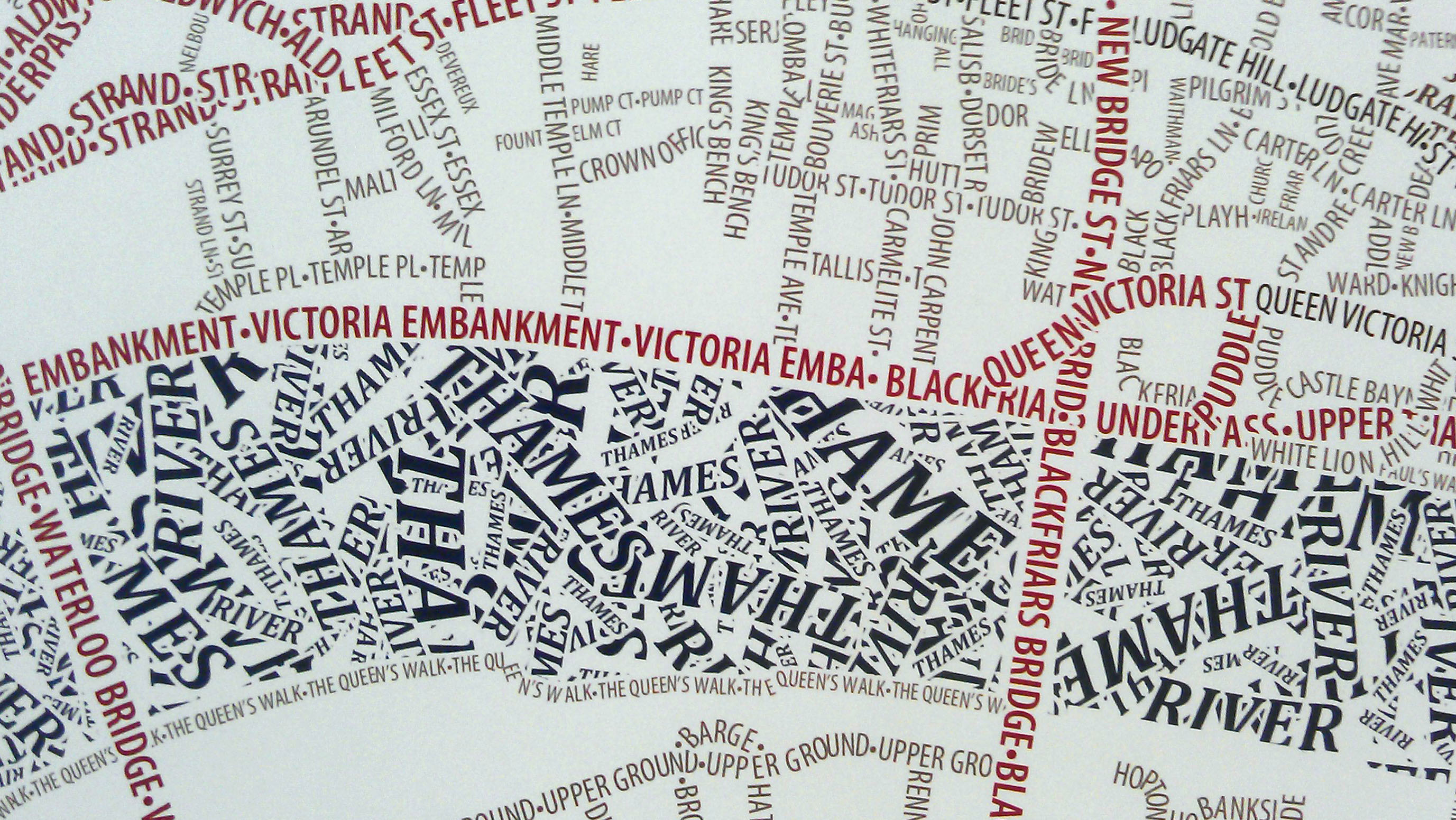
This is part of a map of London from http://mappinglondon.co.uk/2012/typographic-streets/

I like how they did the writing for the Thames river, making the words overlap like water currents.

Tuesday, November 11, 2014

This is my dot density map of veterans in Virginia.