
Tuesday, December 9, 2014
Thursday, November 20, 2014
Weekly Blog Post 10


Weekly Blog Map 7

Weekly Blog Map 3

I like how they did the writing for the Thames river, making the words overlap like water currents.
Tuesday, November 18, 2014

Tuesday, November 11, 2014

Tuesday, November 4, 2014

Final Project Proposal
Assuming that 1 metric ton of coal is converted to electricity at 40% efficiency, for 2,460 kWh/ton.
Given: http://www.sourcewatch.org/index.php/Existing_U.S._Coal_Plants#State-by-state_output
Given: http://www.sourcewatch.org/index.php/Existing_U.S._Coal_Plants#State-by-state_output
| State | 2005 Power Production (GWh) | 2011 Power Production (GWh) | Change (%) |
|---|---|---|---|
| Alabama | 70,144 | 56,807 | -19% |
| Alaska | 650 | 656 | 1% |
| Arizona | 40,730 | 43,702 | 7% |
| Arkansas | 23,356 | 29,418 | 26% |
| California | 3,024 | 1,982 | -34% |
| Colorado | 35,671 | 33,955 | -5% |
| Connecticut | 3,995 | 526 | -87% |
| Delaware | 5,185 | 1,455 | -72% |
| District of Columbia | - | - | 0% |
| Florida | 66,378 | 51,991 | -22% |
| Georgia | 87,624 | 60,159 | -31% |
| Hawaii | 1,548 | 1,424 | -8% |
| Idaho | 51 | 83 | 63% |
| Illinois | 92,772 | 90,013 | -3% |
| Indiana | 123,985 | 104,153 | -16% |
| Iowa | 34,729 | 38,229 | 10% |
| Kansas | 34,595 | 31,656 | -8% |
| Kentucky | 92,613 | 91,656 | -1% |
| Louisiana | 23,190 | 24,628 | 6% |
| Maine | 754 | 55 | -93% |
| Maryland | 29,782 | 21,059 | -29% |
| Massachusetts | 12,095 | 4,059 | -66% |
| Michigan | 71,871 | 58,948 | -18% |
| Minnesota | 34,336 | 28,259 | -18% |
| Mississippi | 16,661 | 9,723 | -42% |
| Missouri | 77,714 | 78,316 | 1% |
| Montana | 17,844 | 15,056 | -16% |
| Nebraska | 20,175 | 25,965 | 29% |
| Nevada | 18,412 | 5,407 | -71% |
| New Hampshire | 4,097 | 2,208 | -46% |
| New Jersey | 12,090 | 4,155 | -66% |
| New Mexico | 29,990 | 27,141 | -9% |
| New York | 22,018 | 9,426 | -57% |
| North Carolina | 78,854 | 59,758 | -24% |
| North Dakota | 29,813 | 27,109 | -9% |
| Ohio | 137,457 | 105,337 | -23% |
| Oklahoma | 36,446 | 34,479 | -5% |
| Oregon | 3,588 | 3,334 | -7% |
| Pennsylvania | 122,093 | 100,603 | -18% |
| Rhode Island | - | - | 0% |
| South Carolina | 40,545 | 34,169 | -16% |
| South Dakota | 2,999 | 2,586 | -14% |
| Tennessee | 59,264 | 40,777 | -31% |
| Texas | 148,759 | 157,897 | 6% |
| Total | 2,026,184 | 1,733,430 | -14% |
| Utah | 36,008 | 33,138 | -8% |
| Vermont | - | - | 0% |
| Virginia | 35,099 | 19,881 | -43% |
| Washington state | 10,483 | 5,229 | -50% |
| West Virginia | 91,601 | 75,964 | -17% |
| Wisconsin | 41,675 | 39,938 | -4% |
| Wyoming | 43,421 | 40,961 | -6% |
Given: http://www.epa.gov/radiation/tenorm/coalandcoalash.html
| Wastes | Radiation Level [pCi/g] | ||
|---|---|---|---|
| low | average | high | |
| Fly Ash | 2 | 5.8 | 9.7 |
I will use the energy produced, the average weight/energy ratio, and the average radioactivity of fly ash (airborn ash) to determine the gross radiation being put out of coal power plants by state.
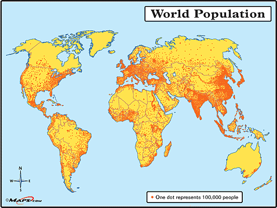
This map is kind of what I'm looking for, but I think I can do a whole lot better.

This map is kind of what I'm looking for, but I think I can do a whole lot better.
This map is more the look that I'm going for, though.

Tuesday, October 28, 2014

Tuesday, October 21, 2014

The colors on the uploaded version are more vibrant than the ones on the printed map. The paper version looks more flat, like the colors are matte as opposed to having a slight sheen. The blue is the most obvious difference. The background that's printed looks better, being a cooler version, but beyond seeing if lightening the blue a little more would help, I wouldn't make any changes.
Weekly Blog Map 5

A biome map of the world, using colors. It uses the connotations of colors to be easier to read.
Thursday, October 9, 2014


Tuesday, September 30, 2014

Weekly Blog Map 4

A 2.5d map of Coe College, using the low angled perspective to put the labels directly onto the page, instead of in a key.
Wednesday, September 24, 2014

Tuesday, September 23, 2014
Map of Police Fatalities by State
I added a link above because the map itself is interactive, and I don't think a media insert would work very well.
I added a link above because the map itself is interactive, and I don't think a media insert would work very well.
Thursday, September 18, 2014

Tuesday, September 16, 2014

I know that this map doesn't fit any of the projections that we've covered so far strictly speaking, but I think that it's closest to a 2.5D planar map of Disney's Magic Kingdom.
I particularly like how it manages to keep the icons both small enough to keep the parts of the park distinct and large enough to read easily, and the colored roads to denote the different sub parks.
Thursday, September 11, 2014

Tuesday, September 9, 2014

Thursday, August 28, 2014
Ebola Outbreaks (2014)

This isn't just a map, since the image also has background information about the virus. I found it on the Huffington Post's website, and it gets its information from the CDC. I really like how it overlays the fruit bat territory over the Ebola outbreak bubbles, showing how it's being spread through the incubator species.
Subscribe to:
Comments (Atom)