http://mason.gmu.edu/~rtolber3/415Final/RawUnemploymentMap.html
Friday, May 8, 2015
Wednesday, May 6, 2015
Weekly Map 10
http://www.nytimes.com/interactive/2015/05/03/upshot/the-best-and-worst-places-to-grow-up-how-your-area-compares.html?_r=0&abt=0002&abg=0
This map is just really neat.
You select a county, and then a popup window tells you how much the average person from that county makes less than the national average at age 26. It also gives you a small blurb on the local area that the county in question is in! This is just a really cool tool. For instance, here's Fairfax County.

Weekly Map 9
#9: This week's task is to find a graphic regarding the earthquake in Nepal. Can be static or interactive. It is always interesting to see maps that are produced on short turnaround!
 I don't like this map. There are simpler ones that convey the needed information much more quickly, and I think this map is much too cluttered, as if the person making it wanted to shove all the possible information on the Nepal earthquake down my throat at the same time. I'd drop all the graphics except for the bottom left one entirely, and I'd take two of the rows off of that one.
Weekly Map 8
#8: Last week's task was to find an interactive Javascript map -- any topic. Think along the lines of Labs 9 and 10.

http://tigerweb.geo.census.gov/datamapper/map.html
This interactive map isn't one that I particularly like. It gives too much freedom to the user, letting them decide the classification system, color palette, and the data displayed. I feel like it's not so much showing the user something as offering to show them everything, and as a result there are a lot of ugly map possibilities.
Weekly Lab 7
This week I want you to find a map that allows you to interact with the display through panning the image around and zooming in and out. Think along the lines of what you can do in Google Maps...but with a neat dataset. Can be any version/style of basemap (i.e. does not have to be Google Maps). This will partner up with what we are doing for Lab 8 today with Leaflet!
http://www.wmata.com/rail/maps/map.cfm
This is a map of the Metro rail system around DC.
 The data displayed on this map doesn't change, but since it's set in a small window the only reason it works at all is because you can zoom in to see details on the stops.
 The data displayed on this map doesn't change, but since it's set in a small window the only reason it works at all is because you can zoom in to see details on the stops.
Weekly Map 6
This week I want you to find a web map that adds interest by utilizing a splash screen. Any style, any topic. Add a sentence or two explaining why you selected it!
 http://mapmaker.education.nationalgeographic.com/
I selected this map primarily because of how unobtrusive the splash screen is. I like that it's smaller than my window and very plain- it doesn't take up a lot of time to read and it has arrows that let you navigate to other hints on how to use the map.
http://mapmaker.education.nationalgeographic.com/
I selected this map primarily because of how unobtrusive the splash screen is. I like that it's smaller than my window and very plain- it doesn't take up a lot of time to read and it has arrows that let you navigate to other hints on how to use the map.
Tuesday, May 5, 2015
Lab 10 Map
I mapped the Cities' Violent Index Crime Rate in 2009, using the data linked in the handout.
http://mason.gmu.edu/~rtolber3/Lab10map.html
Sunday, April 26, 2015
Monday, April 13, 2015
Monday, April 6, 2015
Tuesday, March 24, 2015
Final Project Topic: Initial Idea
Here's the scoop: in approx. 500 words, propose an idea for your Final Project. Explain the topic, the reason you've selected it, the audience of the map(s), the type of visualization you envision (be specific and reference labs we've done if relevant), the data source (and if it has been acquired), the production steps (data processing, software, etc.), and a schedule. Also discuss any issues/obstacles you foresee.
For my final project, I want to make an interactive Flash map of Fenwick Library. The map will have three parts, an index displaying the Dewey Decimal System that will be hidden 'inside' like a pop-up window in a web browser, the map panel, and the information panel. Each of the topic lines in the index will be a button that will minimize the index and display the appropriate floor's map panel, with the relevant aisles highlighted. I'll do the highlighting with adjusted transparency boxes. Users will also be able to manually navigate through the library, changing floors and buildings by clicking buttons and seeing which topics are in aisles they mouse over as the data is displayed in the information panel.
I'll be using labs 2-5 for reference, and I'll need to check Mason's library services to see if they have any maps that I can digitize. If not, I'll need to make the map myself. Since the bookshelf-containing areas of Fenwick are either identical or highly similar from floor to floor, though, this should not be a problem.
I have not yet made a schedule, as my approach for projects this semester can be summed up as "do it as fast as possible, as soon as possible, because oh god there are eight assignments due during the same seven day period."

EDIT: The GMU Library system uses the LC (Library of Congress) organizational system instead of the Dewey Decimal one. I have a (very basic) picture of the floors from a fire escape plan, and will contact Mrs. Cynthia Bentley to see if she has a more detailed one available.
EDIT 2: Here is a rough mock-up, containing one of the buildings and two basic buttons to change between stages.
Monday, March 23, 2015
Index Page for your Mason Site
Okay, so if you're stumped about what's wrong with your mason site, there are a couple of things you'll need to look at first.
First, go to this page. It'll walk you through creating a publicly viewable folder on mason.gmu.edu/~USERNAME.
Now put your lab 6 html file, your va.json file, and your cities.tsv file into that public folder. You still won't be able to see them, and that's because you need an index that tells your computer that they're available to be seen.
index.html is the default page, it'll be the one that gets pulled up when you type in mason.gmu.edu/~YOURMASON.
If you don't have one, you'll need to make an index file. This file can be made in notepad or any other plaintext or html editor, and here's the code for it.
<html>
<head>
<title>YOUR NAME'S Mason Site</title>
</head>
<body bgcolor=blue" text="white">
<h1>Index</h1>
<p>
<a href="NAMEOFYOURLAB.html">Lab 6 Map of Virginia</a>
</p>
</body>
</html>
Just copy and paste that in, fill in the parts that are in allcaps, and put that in your public folder as well.
When you go there, you should see something like this.

Click on the link. If it doesn't lead you to your file, you made a typo somewhere.
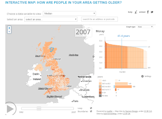
Weekly Map 4 and 5
This map has a really nice interactive timeline. It has a button to enable looping, and you can just click wherever you want on the timeline to change the date displayed. It's also got a lot of options and information that's displayed very elegantly, which I like.
http://www.dailymail.co.uk/news/article-3007777/Britain-s-ageing-population-Interactive-map-shows-20-years-10-people-areas-85.html
This map uses a shape tween.
I don't like it at all, and that's why I chose it. There are over seven different shades of red being used alone, with even more neutral colors being used for non-Axis territory, and it's just a huge mess. You can see in the upper-left corner where the maker edited his base map in what looks like paint, because whatever he used obviously didn't have a color-matching tool.

http://www.dailymail.co.uk/news/article-3007777/Britain-s-ageing-population-Interactive-map-shows-20-years-10-people-areas-85.html

This map uses a shape tween.
I don't like it at all, and that's why I chose it. There are over seven different shades of red being used alone, with even more neutral colors being used for non-Axis territory, and it's just a huge mess. You can see in the upper-left corner where the maker edited his base map in what looks like paint, because whatever he used obviously didn't have a color-matching tool.
Monday, March 16, 2015
Lab 4
There is a bug in this that I cannot fix, that line that comes out of the right-hand side. Despite that, I'm done.
Wednesday, February 25, 2015
Tuesday, February 24, 2015
Weekly Map 3: Toggles
This map uses an interactive menu to apply choropleth-style masks onto a map. It also offers the choice of a variety of base maps and is, in general, just all kinds of fun to play with. It's zoomable, click-and-drag-able too.
National Geographic Mapmaker

National Geographic Mapmaker
Monday, February 23, 2015
Monday, February 9, 2015
Weekly Map 2- Flip Book Style Map

The title given is "Map: Rebels' path through Iraq", and this is a map where you click the arrows on the left or right, and it moves the screen through close-up views of where major events in the Islamic State's expansion have taken place.
It's very simple, but also very compelling because of that simplicity.
Monday, February 2, 2015
Lab 1 Map
This is Banda Aceh in Sumatra. It was hit by a tsunami in December 26th, 2004. The first picture shows the coast in the aftermath of the tsunami.

The areas circled in yellow have been washed away by floodwater.

The same outlined areas from the first picture have been moved to the after-tsunami picture. This shows the sheer size of the land that was utterly destroyed by the tsunami.
GGS 411 - Found Map 1
This is a screenshot of the Smithsonian's interactive tornado map, showing all tornadoes in the United States since 1980. The actual map is found here, if you want to play with it. I know I spent a good fifteen minutes messing around with it.
 First off, there's tons of data on this map. I mean there is over thirty years worth of data displayed on my computer screen, and it isn't a large screen. The interface is intuitive- simply click a year to see display its tornadoes and their data. The buttons that you click make up a histogram that shows the pattern of tornado activity over time, too. In general, this is just a very simple, easy to use map that shows an extremely large amount of data.
Subscribe to:
Comments (Atom)