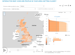
http://www.dailymail.co.uk/news/article-3007777/Britain-s-ageing-population-Interactive-map-shows-20-years-10-people-areas-85.html
This map uses a shape tween.
I don't like it at all, and that's why I chose it. There are over seven different shades of red being used alone, with even more neutral colors being used for non-Axis territory, and it's just a huge mess. You can see in the upper-left corner where the maker edited his base map in what looks like paint, because whatever he used obviously didn't have a color-matching tool.


No comments:
Post a Comment